Power BI · Automation · Windows software · Microsoft Excel

Data that works

Creating time and making money for busy people and businesses.

A monochrome scatter chart of levelised cost of energy against photovoltaic penetration, with a data table of scenario results beneath it.
Energy scenario model
01Power BI &
data visualisation
02Process automation
& data pipelines
03Windows application
software
04Excel & spreadsheet
engineering

By the numbers

78Client engagementsSince 2020
690Power BI files authored487 .pbix / 203 .pbit
19Live BI deploymentsScheduled refresh
10Vendor cloud APIs integratedSolar, telematics, IoT
6Windows apps shippedPackaged & versioned
4Continents servedAfrica, EU, ME, UK

The spreadsheet was
where it started.

I still build the best spreadsheet in the room. But most of what clients now ask for outgrew a workbook years ago: dashboards that refresh themselves overnight, pipelines that pull from ten vendor clouds without anyone touching a file, and desktop applications that a lab technician opens every morning.

Same person, same obsession with getting the numbers right. Bigger machinery behind it.

What I build

Power BI &
data visualisation

01

Semantic models built properly: star schema, DAX that survives contact with real data, row-level security, and refresh that does not break at 6am. Report design that answers the question on page one instead of burying it on page nine.

Semantic modellingDAXPower Query / M RLSGateways & refreshPaginated reports Report theming
Process automation
& data pipelines

02

The unglamorous layer that makes the dashboard possible. Vendor APIs reverse-engineered and wrapped, orchestration that retries and alerts instead of failing silently, and a warehouse the reports can actually trust.

n8n orchestrationREST & OAuth integrationPython PostgreSQL / SupabaseScheduled ETLAlerting & digests

Windows application
software

03

When a dashboard is not enough and enterprise software is too much: installable Windows applications with a real database behind them, multi-user over the network, versioned releases and a backup story.

Electron desktopSQLiteMulti-user over LAN / RDP Offline-firstSigned installersRelease management

Excel & spreadsheet
engineering

04

Still here, still the fastest route to value for the right problem. Quoting tools, cash-flow models, schedulers and costing engines, built to be handed over rather than to depend on me.

Financial modelsQuoting & costing toolsPower Query VBA where warrantedData cleaningTemplate systems

Selected work

Problems solved,
across industries.

Most engagements sit under NDA, so these are described by shape rather than name. Named references available on request.

Fleet telematics

Multi-country fleet analytics programme

Six years as the reporting arm of a global telematics provider. Driver-behaviour, event and utilisation models delivered to end clients in oil & gas, industrial gas, utilities and logistics across the Middle East, Europe and Africa, plus a multi-organisation communications-alarm dashboard and a series of controlled vehicle test programmes.

326 report filesMulti-org RLSScheduled refreshVendor API extraction
Renewable energy

Solar & battery portfolio monitoring

Ten inverter and battery vendor clouds, each with its own auth scheme, rate limits and undocumented quirks, normalised into one warehouse and one reporting layer. Automated month-end client reporting, generation and yield tracking, tariff arbitrage analysis, and alarm digests that flag a dead site before the client notices.

n8n pipelinesSupabase warehouse10 vendor APIsAutomated month-end packs
Pharma & life sciences

Calibration and thermal validation reporting

Temperature mapping, calibration and cold-chain qualification data turned into review-ready reporting for a regulated-industry service provider and its pharmaceutical clients. Sensor exports to statistical summary to signed evidence, across twenty-plus validation programmes.

164 report filesIoT sensor ingestionStatistical summariesAudit-ready output
University research lab

Laboratory QC desktop application

A packaged Windows application replacing a fragile shared workbook: assay quality-control tracking with Levey-Jennings charting, multi-analyst access over the network, local database, versioned releases and automated backups. Later forked into a second variant for an adjacent assay group.

Electron + SQLiteMulti-userLevey-Jennings QCSigned releases
FMCG market research

Informal-trade market study to board deck

Thousands of informal-trader survey responses for a multinational food brand, cleaned, modelled and interrogated, then translated from a Power BI model into a board-ready presentation. The hard part was not the charting; it was establishing which population each number actually described.

Survey data cleaningPower BI modelExecutive deckPopulation framing
Investment & property

Investment committee reporting model

Portfolio and deal-flow reporting for an investment firm, and separately a daily deal-tracking and operations dashboard for a precious-metals trader. Both cases: replace a manual month-end scramble with a model that reconciles and a report that is already correct when it opens.

Financial modellingDaily operational reportingReconciliation

Portfolio

Projects I can
actually show you.

Client dashboards mostly live behind an NDA. These do not: public data, my own questions, and a few builds cleared for showing.

Farm operations management tool
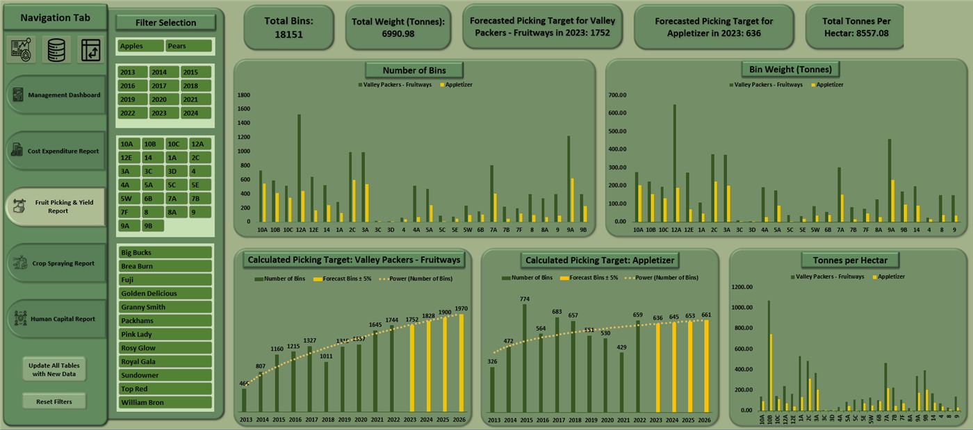
Farm operations dashboard: navigation tabs, variety and block filters, bins and bin-weight charts, calculated picking targets and tonnes per hectare
Project type
Functional data dashboard, reports, insights and analysis
Date
March 2023
Location
Cape Town, South Africa

The problem

  • Our farm is a dynamic environment with various business areas. How can we best visualise all the data we generate and report on our key metrics to enhance management and operating level controls and decision making relating to costs, expenses and profitability?
  • The tool must help us forecast our picking and yield totals so we can set staff expectations per orchard.
  • The tool must also be cost effective and allow for live views of currently entered farm data.

The solution

  • Design, structure and create a data-rich dashboard broken down into specific modules to report on key business areas.
  • Modular design reflects each farm business unit.
  • Each module uses a mixture of informative graphics and aggregated filters to provide a high-level management view, as well as allowing for drilling down to answer the main business question.
  • Data is live and is drawn via queries from a constantly updated Google Sheet. This enables up to date information at all times.
  • Macro-enabled buttons to refresh all tables or reset all filters.
  • Integrated forecast calculations use past farm data to estimate current picking and yield patterns, informing minimum picking totals for farm teams per orchard.
  • Graphics include bar and line graphs.
  • Call-out cards to highlight key statistics.
  • Icon buttons to quickly navigate to different views, for example home screen, modules, data tables or raw data.

The data tool

  • Visualisation in Microsoft Excel.
  • Data refreshed at 10 minute intervals from Google Sheets, or manually when a button is pressed.
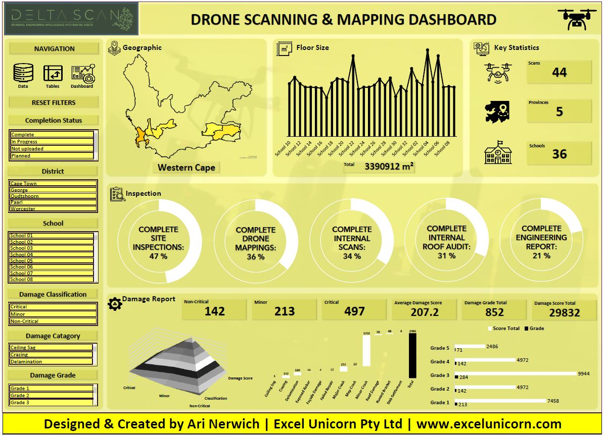
Delta Scan: drone scanning and mapping dashboard
Delta Scan drone scanning and mapping dashboard with a Western Cape map, floor size chart, completion status rings and a damage report section
Project type
Functional data dashboard, data visualisation
Date
February 2023
Location
Johannesburg, South Africa

The problem

  • How do we effectively communicate the huge amount of data we collect from drone mapping and scanning projects to our clients?

The solution

  • Design, structure and create a data-rich dashboard using effective graphics for exploratory analysis.
  • Include different filter levels allowing quick drilling down to specific options.
  • Use a mixture of informative graphics, such as geo-location maps, bar and line graphs, pie charts and waterfall charts.
  • Use call-out cards to highlight key statistics.
  • Icon buttons to quickly navigate to different views, for example dashboard, data tables or raw data.
  • Macro-enabled button to reset all filters.

The data tool

  • Visualisation in Microsoft Excel.
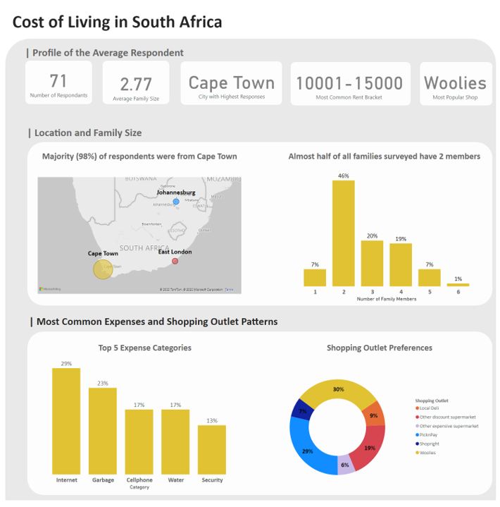
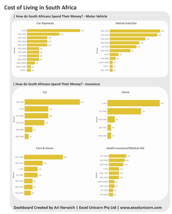
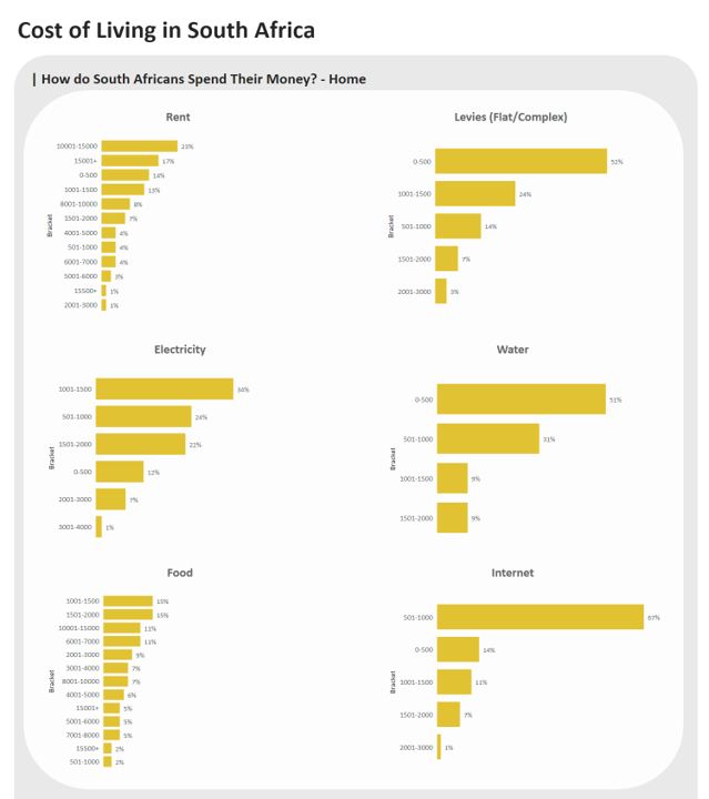
Cost of living in South Africa
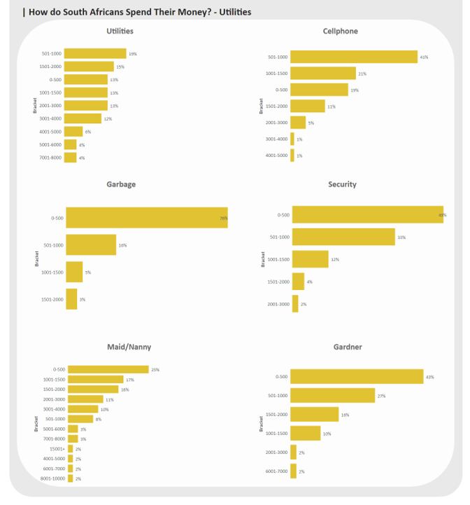
Cost of living dashboard showing respondent profile tiles, a map, family size distribution, top expense categories and shopping outlet preferences Cost of living analysis page showing expense category breakdowns Cost of living analysis page showing rent and income comparisons Cost of living analysis page showing shopping outlet and spend patterns
Project type
Data analysis, data visualisation
Date
January 2023
Location
Cape Town, South Africa and London, United Kingdom

The problem

  • Where do South Africans spend their money and what does this tell us about the cost of living in South Africa?

The solution

  • Design, structure and build a data-rich dashboard to answer key questions about the different expense categories of surveyed South Africans.
  • Each chart is fully interactive, allowing drilling up or down of information by selecting a specific image or part of the image.
  • Maps, bar charts and pie charts showcase quantitative and qualitative insights and trends.
  • Call-out cards highlight important statistics and draw the viewer's attention.

The data tool

  • Data provided by Justis Saayman in the United Kingdom.
  • Data provided in Microsoft Excel from a Google Form survey.
  • Visualisation in Power BI.
The marathon “top 10”
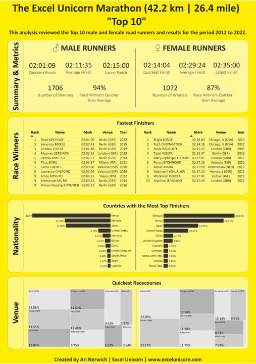
Marathon Top 10 analysis showing male and female summary metrics, fastest finisher tables, nationality distribution and venue comparison charts
Project type
Web scraping, top N, data visualisation
Date
December 2022
Location
Cape Town, South Africa

The problem

  • When you have bucket-loads of complex data, how do you narrow down the meaningful insights effectively and efficiently?

The solution

  • A useful tool is the top N records from the data, where N is any number you would like to investigate.
  • To demonstrate this, a look at the top 10 filters of my favourite sport: running.
  • I wrote a Power BI query to web-scrape all road running data from 1963 to 2022 from worldathletics.org.
  • This resulted in a unique database of 77,300 data points, where the top 10 records were filtered for key metrics, race winners, nationality and venue.
  • From here we can easily track the top runners of our time, the quickest marathon running times, which courses are the most conducive to a quick finish, and who the highest ranked runners are.

The data tool

  • Data preparation and visualisation in Power BI.
South African weather data
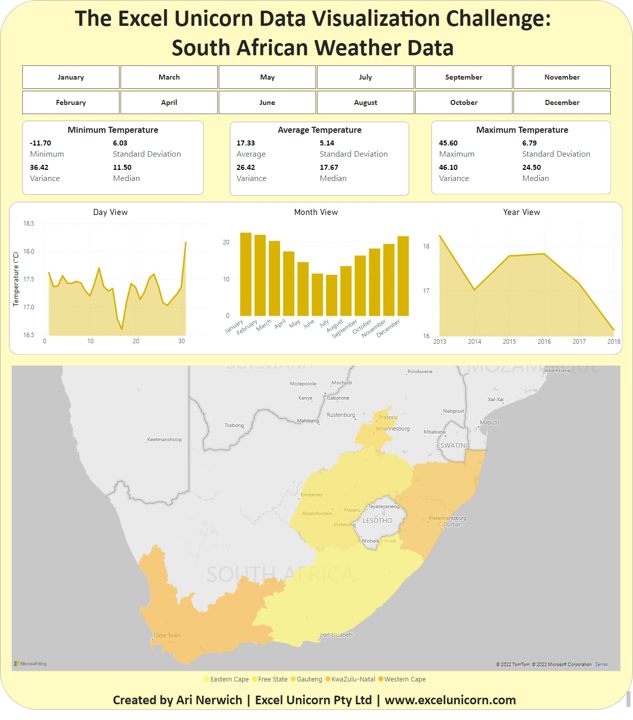
South African weather data dashboard with month selectors, minimum, average and maximum temperature statistics, day, month and year trend charts, and a provincial map
Project type
Data visualisation, data challenge
Date
November 2022
Location
Cape Town, South Africa

The problem

  • How do you visualise a complex data set in a simple to understand format for any user level?

The solution

  • Design, structure and build a data-rich dashboard using minimal graphics and advanced filters.
  • Report on temperature data at a day, month and yearly level.
  • Use a mixture of bar and line graphs for graphical trends.
  • Use call-out cards to report on minimums, maximums, averages, standard deviation and median values.

The data tool

  • Data preparation in Microsoft Excel.
  • Visualisation in Power BI.
Staff training versus customer experience
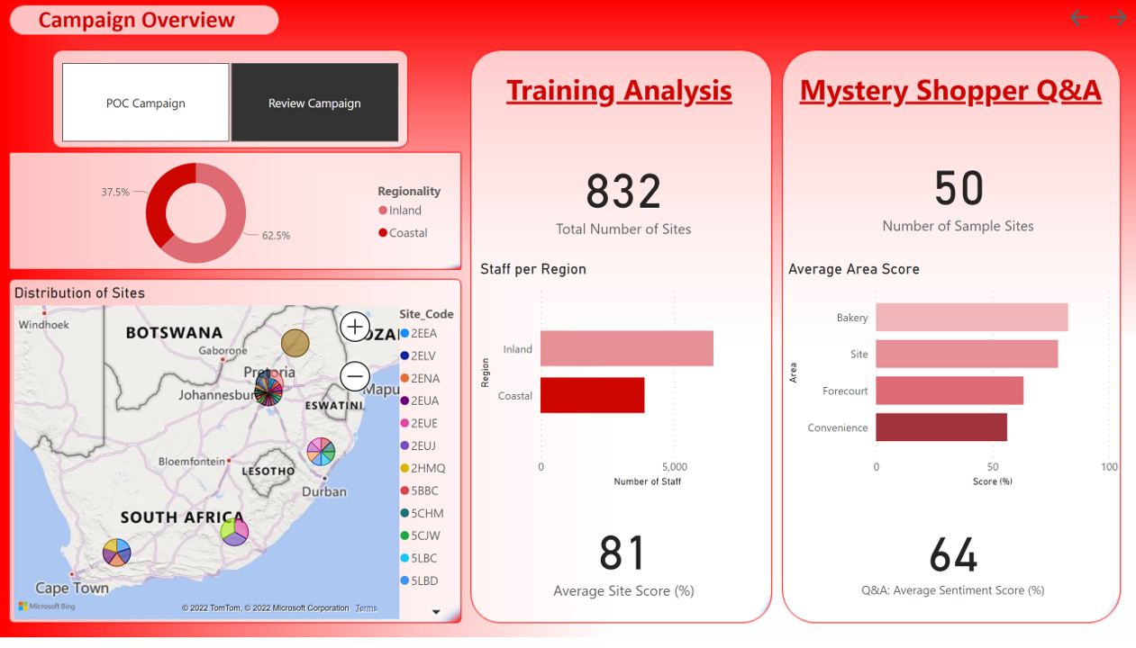
Campaign overview dashboard with a coastal and inland split, a map of southern Africa with site clusters, staff per region, mystery shopper area scores and sentiment
Project type
Data visualisation
Date
October 2022
Location
Cape Town, South Africa

The problem

  • What is the impact of staff training on performance and customer experience, and where is there space for improvement?

The solution

  • Design, structure and build a data-rich dashboard to answer key questions.
  • Develop a minimum viable product to showcase staff training against shopper survey results in a meaningful way, to identify gaps and enhance the consumer experience at a site level.
  • Each chart is fully interactive, allowing drilling up or down of information by selecting a specific image or part of the image.
  • Maps, bar charts, pie charts and tables showcase quantitative and qualitative trends.
  • Call-out cards highlight important statistics and draw the viewer's attention.

The data tool

  • Data preparation in Microsoft Excel.
  • Visualisation in Power BI.
Renewable energy ROI presentations
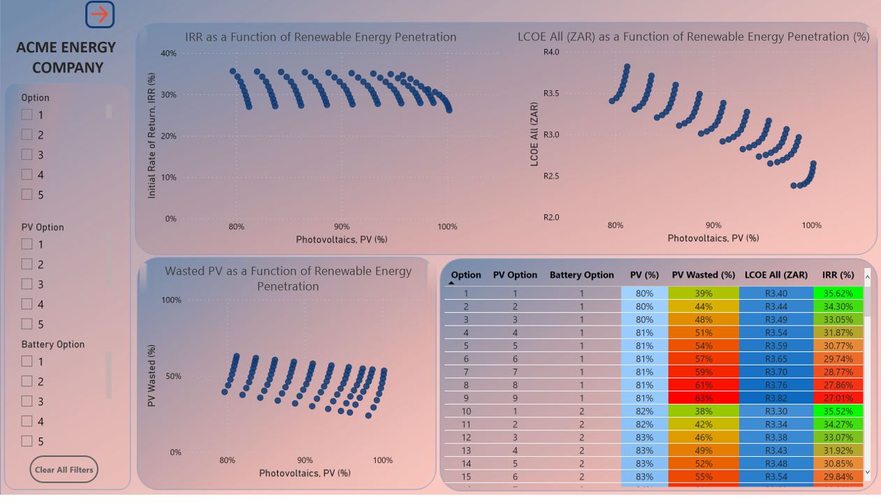
Renewable energy dashboard with internal rate of return and levelised cost of energy plotted against photovoltaic penetration, and a colour-coded scenario table
Project type
Data visualisation
Date
October 2022
Location
Cape Town, South Africa

The problem

  • How do we enhance clarity, discussion and engagement around design options in client ROI presentations?

The solution

  • Create advanced, but accessible, ROI presentations that offer clear direction.
  • Design, structure and build a data-rich dashboard using minimal graphics.
  • Incorporate advanced filters to allow quick views of specific options.
  • Use a mixture of scatter plot and line graphs for graphical trends.
  • Use call-out cards to highlight key present values, minimums, maximums or averages.

The data tool

  • Visualisation in Power BI.

Also built

Sectors

Where the work
has landed.

Seventy-eight engagements, weighted heavily toward regulated and asset-heavy industries where getting the number wrong has consequences.

Pharma & life sciences

Cold chain, calibration, laboratory QC, GxP-adjacent validation reporting and clinical logistics.

Renewable energy

Solar PV and battery storage portfolios: generation, yield, availability, tariff arbitrage and client reporting.

Transport & logistics

Fleet telematics, driver behaviour, vendor onboarding, vehicle validation and courier operations.

FMCG & retail

Market research, route-to-market studies, supplier cost comparison and margin analysis.

Property & facilities

Portfolio operations, maintenance tracking, utilities and metering reporting.

Financial & professional services

Investment reporting, deal tracking, cash flow and practice management tooling.

Agriculture

Farm operations management, punch tracking and seasonal yield reporting.

NGOs & research institutes

Survey analysis, membership databases and funder reporting for policy and education bodies.

Your business sector

Not here? The shape of the problem is usually the same. Let's talk.

How it runs

Four steps.
No surprises.

Every engagement follows the same sequence, whether it ends as a dashboard, a pipeline or an installer.

01

Conversation

What decision are you trying to make, and what is stopping you? Free, and often the point where the brief changes shape.

02

Data audit

I go to the actual source, whether that is the export, the API or the system, before quoting. Most scoping failures are provenance failures.

03

Build & review

Fixed scope, working versions you see early, and one change at a time on anything already in production.

04

Handover

Documentation, a walkthrough, and your team trained to own it. Ongoing support is an option, not a dependency.

Enablement

Built to be
handed over.

The best outcome is that you stop needing me. Every build ships with a handover: how the model is structured, where the data comes from, what breaks it and how to fix it.

Where a team wants to go further, I run focused sessions on the thing they will actually maintain, not a generic course.

Typical enablement scope

  • Power BI model walkthrough: how the star schema, relationships and key measures fit together
  • DAX for the measures your team will need to add after I leave
  • Power Query maintenance: adding a source, changing a column, fixing a broken step
  • Refresh, gateway and credential troubleshooting
  • Advanced Excel for analysts, pitched at your real files rather than sample data
  • One-on-one or small group, in person or remote

About

My wife thinks I'm weird because I love data.

She is not wrong. I love Power BI, pipelines, spreadsheets and numbers, and using them to solve problems for businesses, freelancers, consultants, NGOs, SMEs and everyone in between.

I came to this from a laboratory. Biochemistry masters, then nine years as a pharmaceutical validation consultant in cold chain and temperature management, an industry where you do not get to be approximately right, and where every number has to be defensible to an auditor. That is still how I build.

Together we will connect the data dots to tell a story that makes complicated findings memorable, and automate enough of the execution that you get to spend your time thinking instead.

MSc Biochemistry & Cell Biology, Wits BSc Hons ISTA Pharma Committee, extended team 9 yrs pharma validation consulting Power BI Desktop, Maven Analytics Quality assurance in pharma

Track record

  • 2020 – present
    Business intelligence, automation and application development consultant
  • 2021 – present
    International Safe Transit Association, Pharma Committee, extended team
  • 2024
    Power BI Desktop, Maven Analytics
  • 2013 – 2022
    Senior pharmaceutical validation consultant, cold chain and temperature management
  • 2012
    MSc, Biochemistry & Cell Biology, University of the Witwatersrand

In their words

Through his one-on-one training, The Excel Unicorn helped me master Excel dashboards.
Ilana
He took that info and turned it into a functional dashboard that was a work of art.
Darryl
Of all the consultants I have worked with, this was by far the best and most rewarding I have ever experienced.
Jerome · Chief Financial Officer
Ari is a great teacher, the best I have encountered in the last ten years.
Diane

Contact

Not sure how to make your data work for you? Let's chat.

Have a burning question? Got a problem you want solved? Not quite sure how I can help you grow your business, but you're sure that things could be more effective and efficient? Let's have a conversation and take it from there.

Start a conversation